
I recently wrote a children’s book called D is for Data: The ABCs of Data Analytics. This is the seventh in a series of behind-the-scenes, companion articles that will dive a little deeper into each term. We’ll explore the illustration used to define the term, how the word is used in the data world, and other interesting (to me) trivia.
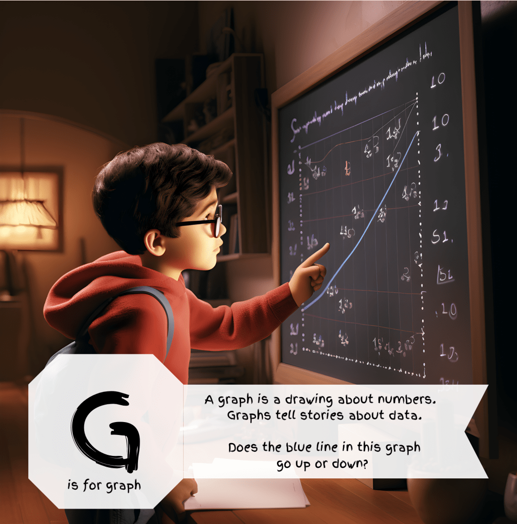
Graphs tell stories about data. That’s really true. Data on its own can be rather cold and lifeless. It takes an analyst to wake it up and shake it up and tell its story. I imagine that the boy in this picture is explaining this blue line to someone. This blue line is somehow going to be the beginning of something big!
If you need convincing that graphs tell stories, just head over to dataisbeautiful on Reddit. Here is exhibit A, a graph from a new mom on maternity leave showing diaper changes and feedings – https://www.reddit.com/r/dataisbeautiful/s/Gf5FdBqzse.
Another good example is the ESPN win probability graph. As one team scores more points, their chance of winning increases. And sometimes, there are surprise endings. The graph tells the story. http://www.espn.com/espn/feature/story/_/id/21929169/the-craziest-win-probability-swing-plays-2017-nfl-regular-season


Leave a comment