
I recently wrote a children’s book called D is for Data: The ABCs of Data Analytics. This is the fourth in a series of behind-the-scenes, companion articles that will dive a little deeper into each term. We’ll explore the illustration used to define the term, how the word is used in the data world, and other interesting (to me) trivia.
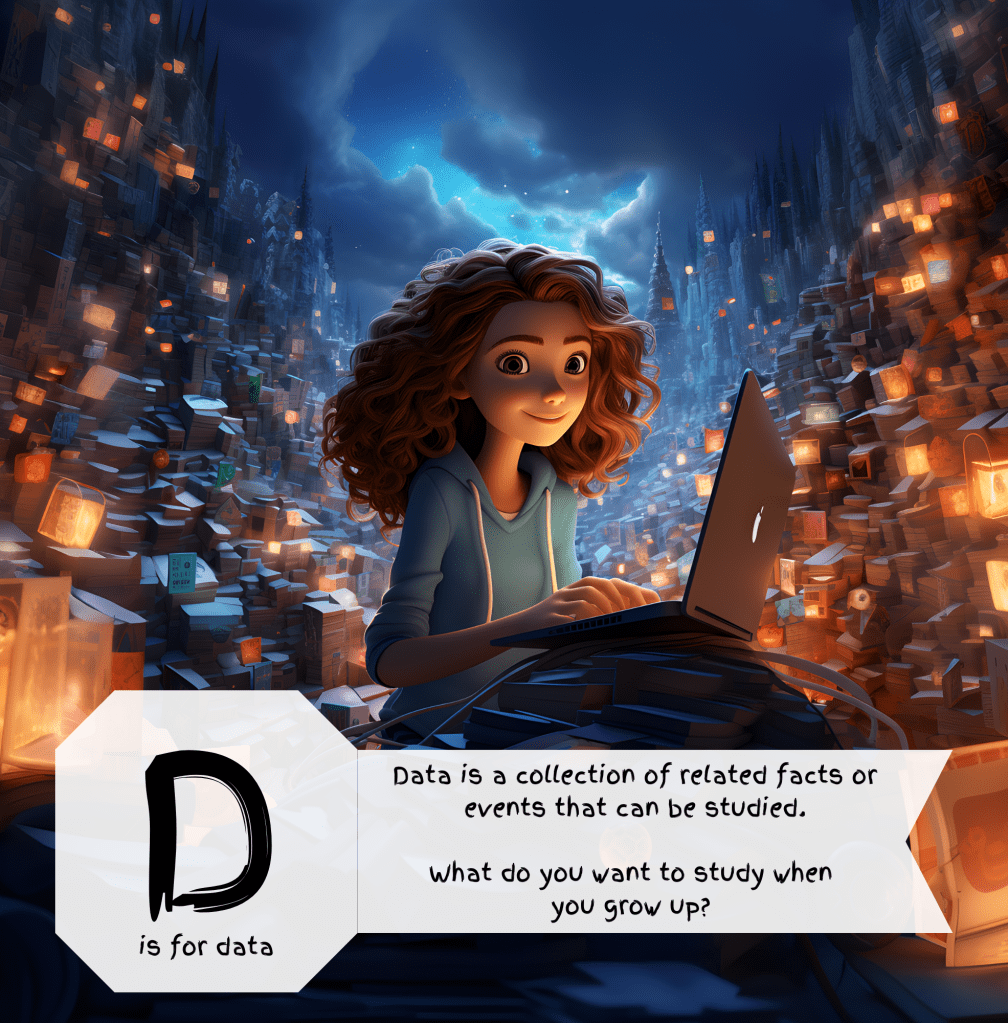
We finally arrive at the book’s namesake, data. What is data? It’s a collection of facts that can be studied. Why did I illustrate data as a girl at a laptop, and where is this girl? First the setting, she’s on top of a mountain of data. I like this context because it looks like the beginning of a great adventure. Every time I look at data, it’s an adventure, and I learn things. Second, it’s a girl with a laptop because she’s the hero of the adventure. She is going to use this mountain of data to unlock some secret knowledge that will take her on an adventure of great importance. What type of adventure? I don’t know. That’s for her to decide!
In the data world we talk about datasets. A dataset is usually made up of several files or tables and covers a certain topic. There are several famous datasets that you may have heard of. John’s Hopkins and the New York Times both have datasets related to the Corona virus pandemic. These include testing results, hospitalization counts, vaccination rates and even local and regional policies. ImageNet is a dataset of labeled images. Need hundreds of example pictures for a word, ImageNet has them. And I’ll make a shameless plug for Walmart Luminate, which is a dataset that allows suppliers to better understand their customer and their store. Even before I joined Walmart, I was attracted by its large investment and innovative ways of collecting and sharing data.
Datasets are curated by a special breed of professionals called data engineers. Data engineers build the pipelines that draw the data out of various source systems. This has been compared to drilling for and extracting crude oil from the ground. The next step is to refine the data by applying data quality rules, enriching it and aggregating it. This is similar to refining crude oil into gasoline or diesel. Another popular metaphor for this refinement process is called “medallion architecture.” Medallion architecture is named after the medals at the Olympics. Bronze data is unrefined raw data. Silver data is cleaned and enriched. Gold data is aggregated into useful tables that you can use to gain insights. For example, it would not be practical to see every sale of an item from every store, but by looking at the daily or weekly sales over time, you could begin to see a trend. Gold data gives valuable insights by letting you see the trends.


Leave a comment